History and symbols
Context analysis and client conversations helped define which elements of tradition the mark should reference.

Logo and everyday communication materials for a parish with 800 years of history.
A parish identity system combining a clear mark with local tradition and religious symbolism.
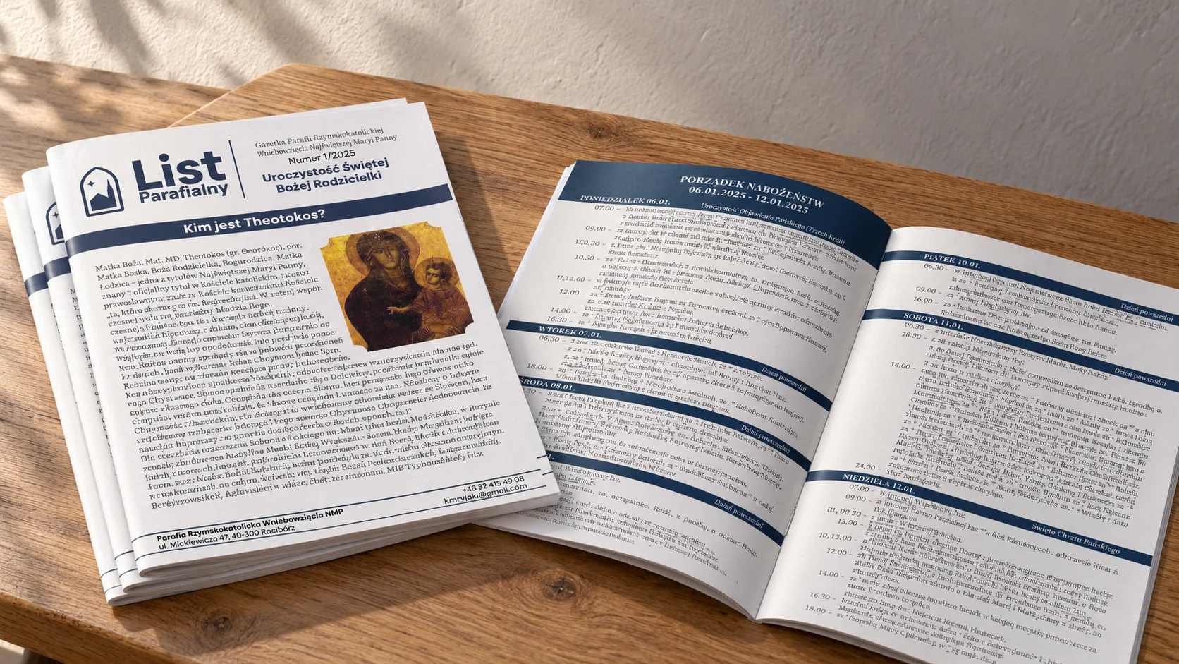
Mockup / visualisation“List Parafialny” — publication cover and spread visualisation.
Logo · Identity system · Key visual · Parish bulletin · Printed materials
Independent project direction and implementation
2025 / Implemented project
A parish with around 800 years of history needed a complete visual system. The mark had to be recognisable and legible while retaining links to tradition.
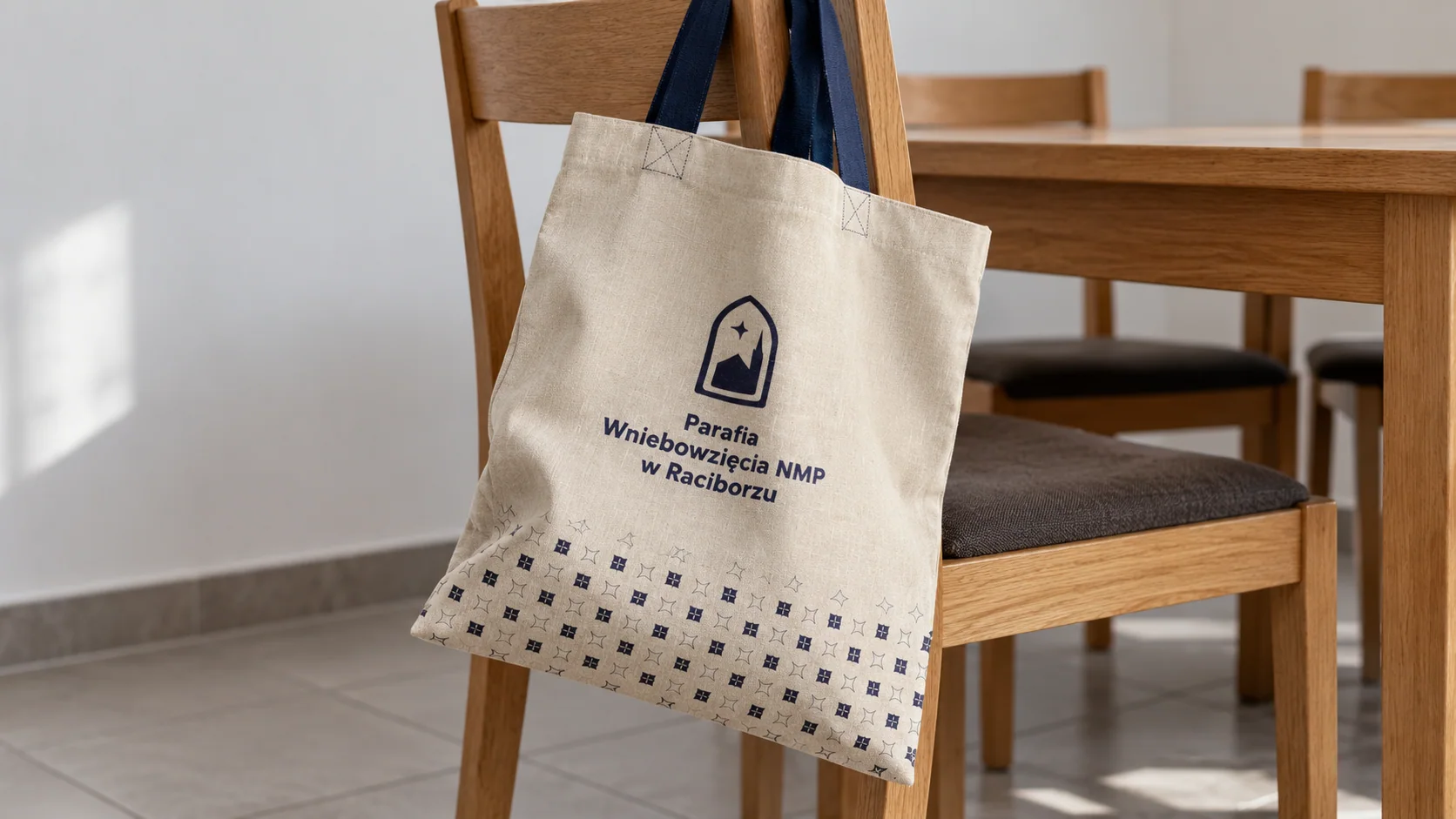
I based the system on symbols directly connected to the church and on religious symbolism. The navy blue also carries meaning within Catholic theology.
Context analysis and client conversations helped define which elements of tradition the mark should reference.
A moodboard and concept variations led to a simplified system of symbols and a navy palette.
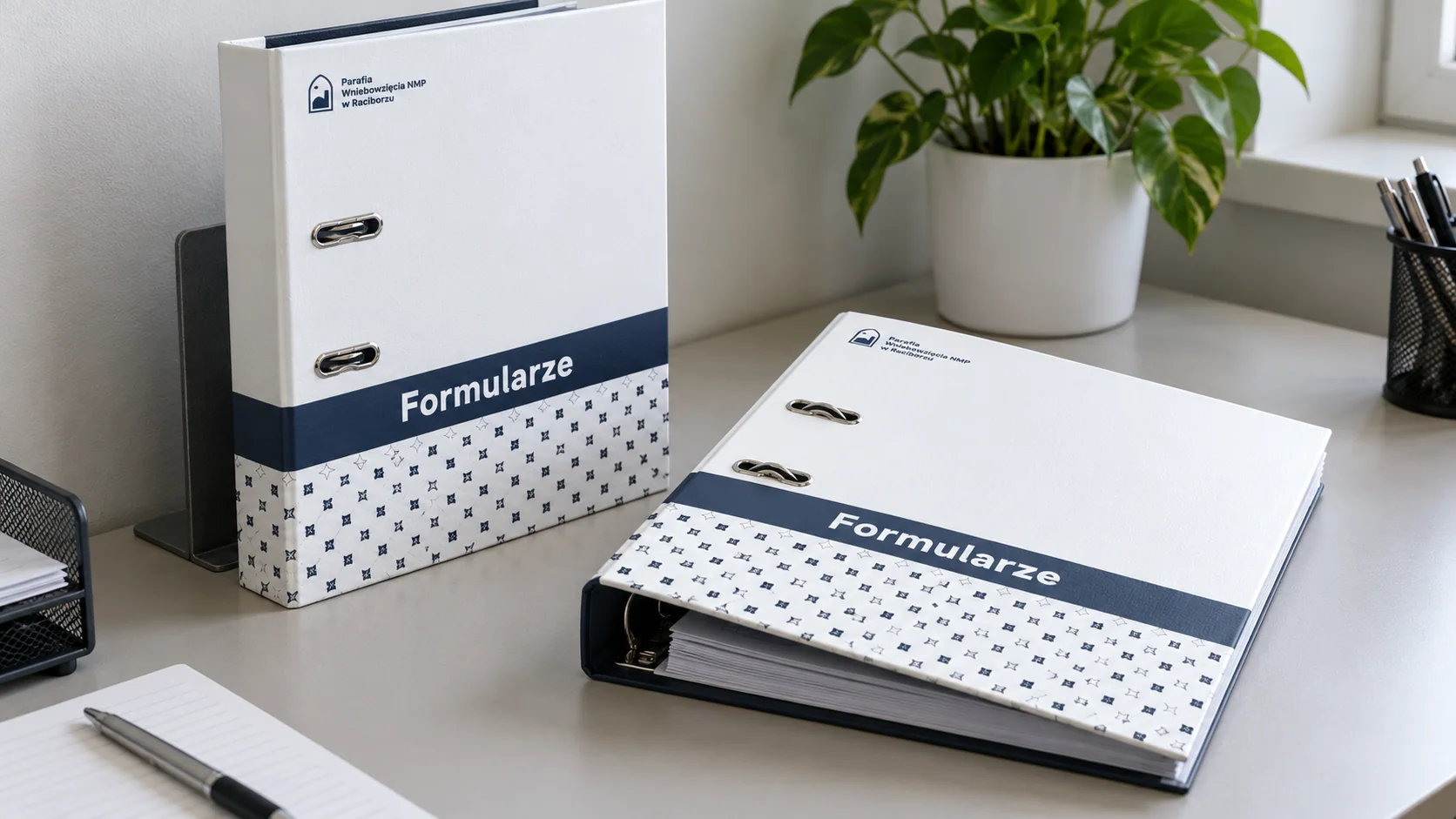
I extended the identity to the bulletin and printed materials, supervising implementation.
I created the logo, identity system, “List parafialny” parish bulletin design and promotional materials. A separate planned phase is the parish house signage system — indoor and outdoor signs.
Tell me what you have in mind. We will discuss the scope, direction and how I can help.
bartlomiej.kempe@gmail.com ↗