Context
Research and a moodboard brought together the two starting points: science and the event's regional roots.

Posters, presentations and a website for a science event in Silesia.
A complete visual language bringing together the event's scientific focus and regional identity.
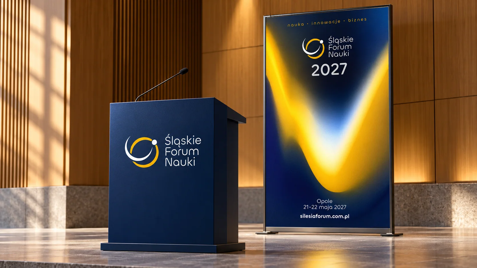
Mockup / visualisationConference graphics — visualisation of a lectern and poster. Identity designed in 2026, materials for the 2027 edition.
Logo · Identity system · Key visual · Print · Website design · Presentation materials
Independent project direction, design and implementation
2026 / Implemented project
The forum needed a fresh identity reflecting its scientific focus and Silesian roots. The mark was to be the starting point for a system working across many formats.
I built the system around abstract, orbit-like shapes meeting at a shared point. Two colours reference Silesia and give structure to the event's communication.
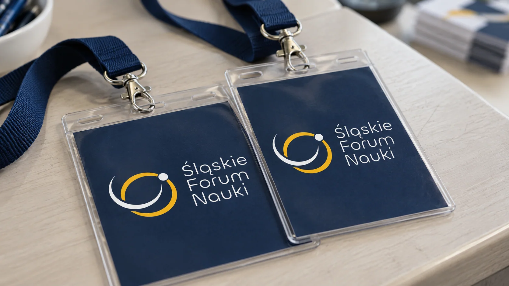
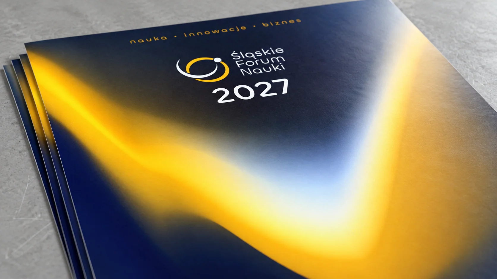
Research and a moodboard brought together the two starting points: science and the event's regional roots.
I developed the orbit motif into a mark and visual language. Mockups and feedback helped test its applications.
I applied the identity to the website, print and presentation materials, and supervised implementation.
I created the logo, a complete identity system, printed materials, a website design and presentation elements. The identity was fully implemented.
Tell me what you have in mind. We will discuss the scope, direction and how I can help.
bartlomiej.kempe@gmail.com ↗